How to Optimize Images for Websites: Speed Up Your Site Without Losing Quality
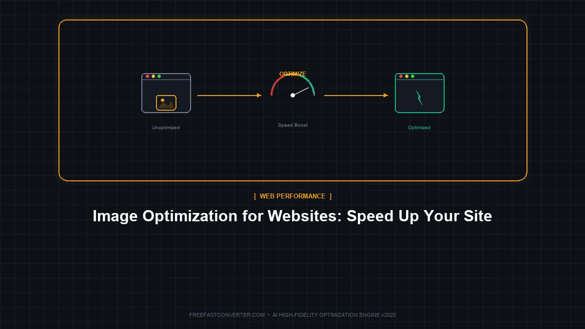
Your website is slow. Users are leaving. Google is ranking you lower. The culprit? Often it's your images.
Images typically account for 50-75% of a webpage's total size. Unoptimized images can turn a fast website into a frustrating experience. But here's the good news: optimizing images is one of the quickest wins for website performance.
This guide shows you exactly how to optimize images for the web—the right formats, sizes, and techniques that make sites lightning-fast.
Why Image Optimization Matters
Before we dive into the how, let's understand the why.
The Performance Impact
| Metric | Unoptimized | Optimized | Improvement |
|---|---|---|---|
| Average image size | 2-5 MB | 50-200 KB | 90%+ smaller |
| Page load time | 5-10 seconds | 1-2 seconds | 4-8x faster |
| Data transfer | 10+ MB | 1-2 MB | 80%+ savings |
"Pro tip: Google's research shows that 53% of mobile users abandon sites that take longer than 3 seconds to load. Every second of delay costs you visitors."
SEO Benefits
Google uses page speed as a ranking factor. Faster sites rank higher. Image optimization directly improves:
- Core Web Vitals (LCP, CLS)
- Mobile rankings (speed matters even more on mobile)
- Crawl efficiency (Google can index more pages)
- User experience signals
The Five Pillars of Image Optimization
Effective image optimization involves five key areas:
- Right format for each image type
- Right size (dimensions) for display
- Right compression level
- Lazy loading for below-fold images
- Responsive images for different screens
Let's cover each in detail.
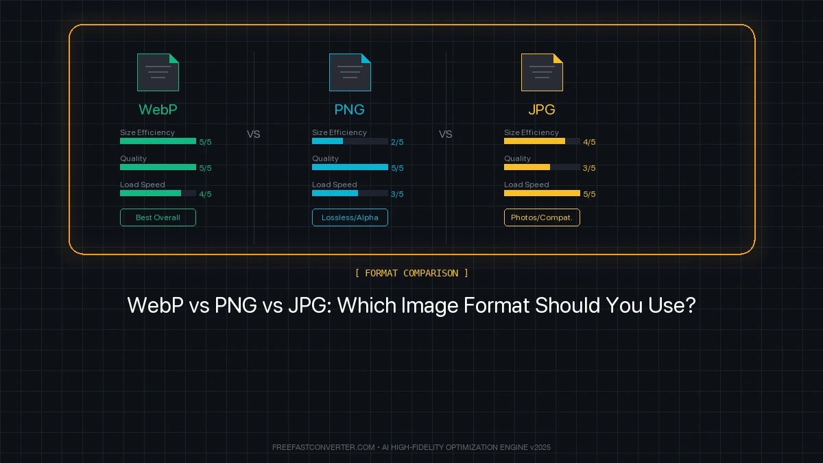
Pillar 1: Choose the Right Format
Different images need different formats. Here's the decision tree:
Quick Decision Guide:
- Photograph or complex image? → WebP (with JPG fallback)
- Simple graphic, logo, or icon? → SVG or PNG
- Need transparency? → WebP or PNG
- Scalable icon/logo? → SVG (always)
Format Comparison
| Format | Best For | Typical Savings |
|---|---|---|
| WebP | Photos, graphics | 25-35% smaller than JPG |
| JPG | Photos (fallback) | Baseline |
| PNG | Graphics with transparency | Larger, but lossless |
| SVG | Icons, logos | Tiny files, infinite scaling |
| AVIF | Future-forward sites | 50% smaller than WebP |
"Pro tip: In 2024, WebP is supported by 97%+ of web browsers. Make it your default format for web images, with JPG fallback for the remaining 3%."
For a deep dive, see our complete guide to image formats.
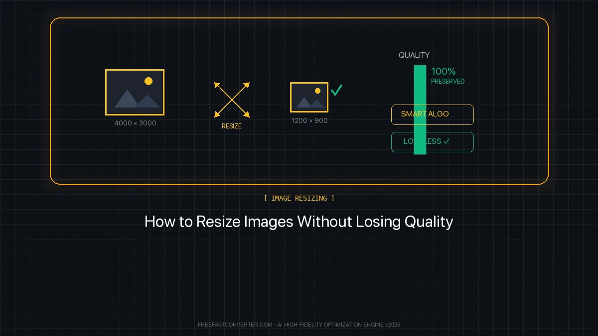
Pillar 2: Size Images Correctly
One of the biggest mistakes: uploading 4000px images when they'll display at 400px.
The Golden Rule
Never serve images larger than their display size.
If an image displays at 800px wide, the file should be 800px wide (or 1600px for Retina displays).
Common Display Sizes
| Usage | Recommended Width | With Retina (2x) |
|---|---|---|
| Full-width hero | 1920px | N/A (too large) |
| Content images | 800px | 1600px |
| Thumbnails | 300-400px | 600-800px |
| Product images | 600-800px | 1200-1600px |
How to Resize Images
Using our converter:
- Visit FreeFast Image Converter
- Upload your image
- Set dimensions to match display size
- Download optimized version
Bulk resizing: See our image resizing guide.
Pillar 3: Compress Appropriately
Compression reduces file size by removing unnecessary data. The key is finding the sweet spot.
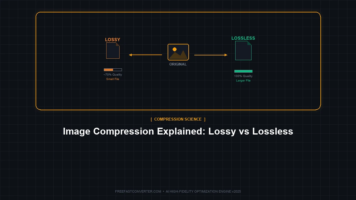
Lossy vs. Lossless
- Lossy (JPG, WebP lossy): Removes data permanently, smaller files
- Lossless (PNG, WebP lossless): Preserves all data, larger files
For photos: Lossy at 80-85% quality is ideal—visually identical but 60-80% smaller.
For graphics: Lossless PNG or SVG preserves crisp edges.
Recommended Quality Settings
| Image Type | Format | Quality | Expected Size |
|---|---|---|---|
| Hero image (1920px) | WebP | 80-85% | 100-200 KB |
| Blog image (800px) | WebP | 80-85% | 30-80 KB |
| Thumbnail (300px) | WebP | 75-80% | 10-25 KB |
| Logo/icon | SVG | N/A | 1-10 KB |
"Pro tip: Visual quality drops rapidly below 70% quality setting. Stay at 75-85% for the best balance of size and quality."
Pillar 4: Implement Lazy Loading
Lazy loading delays loading images until they're needed (when they scroll into view). This dramatically improves initial page load.
How to Implement
Native lazy loading (simplest):
<img src="image.webp" loading="lazy" alt="Description">
That's it! Add loading="lazy" to any image below the fold.
What to lazy load:
- ✅ Images below the fold (not immediately visible)
- ✅ Gallery images
- ✅ Blog post images in long articles
- ❌ Hero images (load immediately)
- ❌ Above-the-fold content
Browser Support
Native lazy loading works in all modern browsers (Chrome, Firefox, Edge, Safari). For older browsers, consider a JavaScript polyfill.
Pillar 5: Serve Responsive Images
Different devices need different image sizes. A phone doesn't need the same image as a desktop monitor.
The srcset Attribute
<img
  src="image-800.webp"
  srcset="image-400.webp 400w,
          image-800.webp 800w,
          image-1200.webp 1200w"
  sizes="(max-width: 600px) 400px,
         (max-width: 1200px) 800px,
         1200px"
  alt="Description"
>
This tells browsers:
- Use 400px image on small screens
- Use 800px image on medium screens
- Use 1200px image on large screens
Simplified Approach
If srcset seems complex, at minimum:
- Create 2 sizes: mobile (600px) and desktop (1200px)
- Use CSS media queries to swap them
Step-by-Step Optimization Workflow
Here's a practical workflow for optimizing website images:
For Each New Image:
- Choose format (WebP for photos, SVG for icons)
- Resize to maximum display width (plus 2x for Retina if needed)
- Compress at 80-85% quality
- Add lazy loading attribute if below fold
- Write descriptive alt text (for SEO and accessibility)
For Existing Websites:
- Audit current images (check sizes and formats)
- Identify biggest files (sort by file size)
- Convert to WebP with fallbacks
- Resize oversized images
- Add lazy loading to below-fold images
- Test page speed before and after
"Pro tip: Tools like Google PageSpeed Insights and GTmetrix specifically flag image optimization opportunities. Run your site through them to find quick wins."
Tools for Image Optimization
Online Tools (No Installation)
- FreeFast Image Converter - Convert, resize, and compress
- Squoosh - Visual quality comparison
- TinyPNG - PNG and JPG compression
Desktop Software
- ImageOptim (Mac) - Drag-and-drop optimization
- RIOT (Windows) - Detailed compression control
- GIMP - Free image editor with export options
WordPress Plugins
- ShortPixel - Automatic optimization on upload
- Imagify - WebP conversion + optimization
- Smush - Free basic optimization
Build Tools
- Sharp (Node.js) - Programmatic image processing
- ImageMagick - Command-line batch processing
- Gulp/Webpack plugins - Integration with build pipelines
Common Mistakes to Avoid
Mistake #1: Uploading Full-Resolution Camera Photos
The problem: A 5000x3000px, 8 MB photo uploaded directly from your camera.
The impact: Massive files, slow loading, wasted bandwidth.
The fix: Resize before uploading. A 1200px wide image is plenty for most web uses.
Mistake #2: Using PNG for Everything
The problem: PNG used for photographs instead of WebP/JPG.
The impact: Files 3-5x larger than necessary.
The fix: PNG for graphics and transparency only. WebP/JPG for photos.
Mistake #3: Forgetting Alt Text
The problem: Images with empty or missing alt attributes.
The impact: Poor SEO, accessibility issues.
The fix: Every image needs descriptive alt text explaining what it shows.
Mistake #4: Not Testing on Mobile
The problem: Images look fine on desktop but destroy mobile performance.
The impact: Slow mobile experience, poor Google rankings.
The fix: Test with Chrome DevTools mobile simulation and real devices.
Frequently Asked Questions
What's the ideal file size for web images?
Aim for:
- Hero images: Under 200 KB
- Content images: Under 100 KB
- Thumbnails: Under 30 KB
- Total page images: Under 1 MB
Should I use WebP or keep JPG?
Use WebP as your primary format in 2024. It's supported by 97%+ of browsers and provides 25-35% smaller files. Provide JPG fallback for maximum compatibility.
How do I add WebP with fallback?
<picture>
  <source srcset="image.webp" type="image/webp">
  <img src="image.jpg" alt="Description">
</picture>
Does image optimization affect quality?
With proper settings, optimization is invisible to users. Use 80-85% quality for JPG/WebP—the difference from 100% is imperceptible.
How do I check my current image sizes?
- Browser DevTools → Network tab → sort by size
- PageSpeed Insights → Image opportunities
- GTmetrix → Waterfall chart
What about CDN for images?
CDNs (Content Delivery Networks) serve images from servers closer to users, reducing latency. Combine CDN with optimization for best results. Popular options: Cloudflare, Imgix, Cloudinary.
Conclusion
Image optimization is one of the highest-impact improvements you can make to website performance. Remember:
The Five Pillars:
- Right format (WebP for photos, SVG for icons)
- Right size (match display dimensions)
- Right compression (80-85% quality)
- Lazy loading (for below-fold images)
- Responsive images (different sizes for different screens)
Quick Wins:
- Convert images to WebP → 25-35% smaller
- Resize to actual display size → Often 80%+ smaller
- Add lazy loading → Faster initial load
- Compress at 80% quality → Invisible quality loss
Ready to optimize? Use our free image converter to resize, compress, and convert your images for web.
Related articles:
- Complete Guide to Image Formats
- How to Resize Images Without Losing Quality
- Image Compression Explained
- Why WebP is the Future of Web Images
Related Topics
On This Page
Share Article
Our Tools
Stay Updated
Get the latest tips delivered to your inbox.